Remix of Success Kid Meme / Extra Credit Blog

About The Meme:

The Success Kid meme is a meme of a young 11 month old toddler with a sluggish / self-congratulatory facial expression. The meme has been depicted to either show frustration or success and is also known as the I Hate Sandcastles meme. According to Know Your Meme, the original image was turned into an advice animal style image in 2011 with captions describing a situation that went better than expected.

SANDCASTLES.png

Before the image was turned into an advice animal meme, it was being used by MySpace users as either part of their page layout or even their avatar as early as January 2008. The “I Hate Sandcastles” name comes from a time around May 2008 when the image was posted on Pyzam with a second child photoshopped into the background with the caption, “I HATE SANDCASTLES.”pic60016_www.kepfeltoltes.hu_

As I said earlier, the image was turned into an advice animal image in early 2011 with captions mostly relating to success and situations that turned out to be better than expected. According to Know Your Meme, as of February 2011, there are over 66,000 instances of Success Kid on Quicklime, nearly 300 on MemeGenerator, and over 3,000 results on the Advice Animals subreddit.

This slideshow requires JavaScript.

Success Kid eventually made his way over to the field of advertising! In February 2012, Virgin Media began using a mirrored image of Success Kid on their billboard campaign for New Rising Media, according to Know Your Meme.

80a

In April of 2015, the mother of Success Kid had created a GoFundMe for her husband who needed a kidney transplant. Just 5 days after the fundraising page was created, The Daily Dot published a story which included a personal email from the mother of Success Kid. The article was eventually posted on the UpliftingNews subreddit. Days after, many news outlets and websites posted articles about the fundraising campaign and within a week, the page reached $88,000 with its original goal only being $75,000.

b7e.png

Screen Shot 2016-04-27 at 11.07.56 AM.png

Remix and Personal Depiction:

When I first look at the image, my thoughts are “This kid is the boss man.” With the combination of his facial expressions and emotion paired with the grasping fist of sand, the toddler portrays the whole go getter type persona who has achieved his goal and almost comes off as a little cocky or boastful.

However, when I look at the image as an advice animal meme style with the success captions, I cannot help but have the same opinion that Know Your Meme iterated as “describing a situation that turned out better than expected.”

I do not think that the “Success” part of “Success Kid” is possible without the captions listed in the advice animal style meme. I personally never felt that vibe when looking at the original image, but more one similar to “I’m the boss, nobody can mess with me” type attitude.

Reflection:

Aside from everything, it’s still amazing that because the popularity of an image of an 11 month old baby blew up to what it is, that it was able heavily contribute to what could have been a life saving procedure for the boy’s father and its absolutely astonishing that a picture of an a child this young grasping sand with a smug on his face could go this viral thanks to what is known as a meme.

By: Derek Lowe

Blog of the Week 4/1

This week I was honored to choose the blog of the week and I did so with trepidation. Who am I to say that one blog is better than another-I am simply a student just like everyone else. With that in mind, I came up with a set of criteria in order to be as objective as possible. The criteria is as follows:

-Features multimodality

-Has different types of multimodality

-Answers every question

So I looked over everyone’s blogs and my choice for Blog of the Week is…..

Taylor Mitchell-Beautiful Florida

Her blog post was awesome because she had all kinds of multimodal features, from links to images to a video, even a gif!

Screen Shot 2016-04-03 at 7.37.13 PM

Screen Shot 2016-04-03 at 7.45.17 PM

This made her post visually appealing and more accessible to all people. She also answered the questions and explained her reasoning. I enjoyed reading her thoughts. Great job!

Blog Post of the Week 03/18

After reviewing everyone’s original visual narratives and remixes I was able to come up with a blog of the week… But before we get to that, I want to acknowledge two other remixes I enjoyed.

Remix 1: Alexis Hart’s Remix

Compared to the original visual narrative, Hart’s remix is packed with a deeper understanding of Disney’s animation roots in Central Florida. Along with the addition of information, the added voiceover guides the viewer through the video, flowing nicely with the use of text, photos, video and music. Great job Alexis!

Remix 2: Miguel Ortiz’s Remix

I didn’t rate this blog post with the others because I would be biased and select it as the blog of the week, but I am sharing it because I like it, I made it, it’s perfect, I’m perfect, it does a nice job of remixing the original work. 🙂

NOW…. FOR THE BLOG POST OF THE WEEK…

…..DRUMROLL PLEASE  J-LO…..


Give it up for: Kelsey Chaloux’s Remix

Not only is the music in this remix super cute, but Chaloux was able to incorporate original images, plus collages of new photos, sped-up video footage, visual effects, and light text to create a visual narrative remix worthy of the title “Blog Post of the Week.” This remix works, not because there was a change in the form of presentation, but because the form change was key in creating a fluent storytelling experience for viewers. Awesome job Kelsey!

Screen Shot 2016-03-22 at 6.52.38 PMScreen Shot 2016-03-22 at 6.52.49 PMScreen Shot 2016-03-22 at 6.52.28 PM


Blog of the Week: 2/25

Y’all. It was so hard to find a blog of the week. Everyone did so well. But if I’m going to pick one, I’m going to say that Ashley Montgomery’s Inside Florida’s Outside takes the cake this week.

Now, there’s lots of ways you could have documented your enjoyable journey through the scavenger hunt. By pointing out Ashley’s (or anyone else’s) way, I’m not suggesting that there’s one right way of doing things. It’s just another way.

What appealed to me about Ashley’s way was the clear movement through the scavenger hunt:

Numbered list with the scavenger hunt language in bold. Answers are in regular typeface.

Font serving as a guide

She uses basic font attributes to guide the reader not only through the scavenger hunt, but through the blog post as well. Here’s a couple of major things I noticed, right off the bat:

  • The list is numbered
  • There are spaces between each numbered entry
  • The scavenger hunt text is in bold, and ends with a period
  • Ashley’s thoughts are in unformatted typeface, making it distinct from all other text

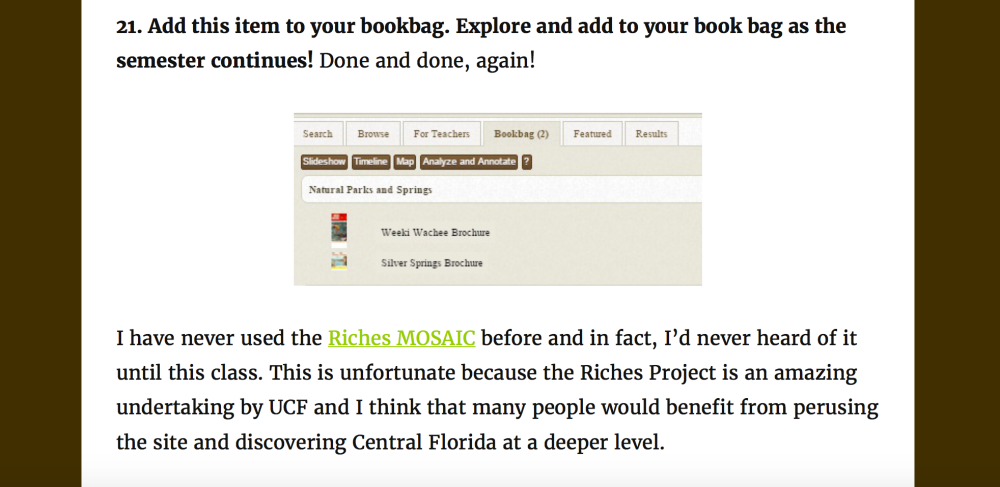
I also really like how Ashley incorporated screenshots and links seamlessly into her post. Not only do her screenshots give us insight into her research experience, but they stand alone to say something about the RICHES database (also evidenced by her link to the Mosaic itself!).

A screenshot and a link

Screenshots and links!

I also like how she pulled in other media to demonstrate what words couldn’t quite capture, and it didn’t feel superfluous; as a matter of fact, without it, Ashley’s allusion to the Escher painting to describe her experience with the website wouldn’t have made sense:

Text with an image of a painting below

Including other media in the blog post

Lastly, I love her commentary at the end of the post:

I think that my documentary subject will require deeper investigation to find any information because it doesn’t seem like many items are archived for “state parks and springs”. I would say that the hardest part of using the Riches MOSAIC website is the font size. It was headache-inducing to look at the website and I think that negatively affects accessibility because people with older eyes or people who have sight disabilities will really have trouble viewing the information.

She even linked to the accessibility page of RICHES — hey oh! Nice thinking, Ashley.


Blog Post of the Week: Feburary 8th

This week I asked y’all to tell me a coming of age story without relying on alphabetic text. It was a hard choice, but the post I’d like to highlight here is Tori Leeworthy’s The Labyrinthine Path.

The first thing I noticed about Tori’s story is just how multimodal it is. There are digital drawings, word art, maps, and professional photographs:

This slideshow requires JavaScript.

The text she included is always part of the images – in some ways, most of the text functions as standalone images. What’s cool is that looking through her post, I really began to ask myself what were the differences between images and text.

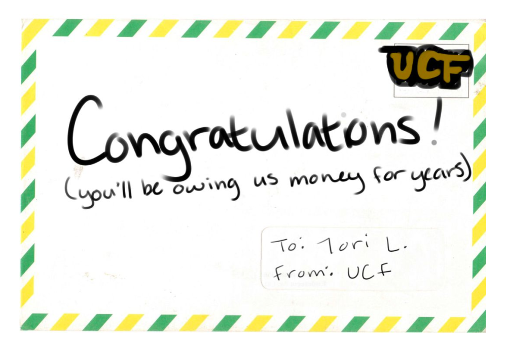
Hand drawn acceptance letter

The acceptance letter, for example

Tori's map that shows a travel line from southern Florida to Central Florida

Or even the map!

The captions provided a great insight into the pictures, but none were necessary to understand the meaning of the pictures she included. For example, under the letter she writes, “The actual letter was a lot fancier than this, but the meaning is all there.”

BoW 2.3

Close up of the letter’s caption

The specificity between the images and the text tell the audience exactly what they need to know without limiting any meaning; in other words, its specific enough to see the chronological progression through the narrative, but not so specific that the audience can’t relate. In McCloud’s words, Tori strikes a nice balance between the very generic cartoon face with the very realistic portrait. In doing so, Tori invites a multitude of readers to identify with her coming-of-age experience of adulting.

Blog Post of the Week: Jan 25th

This week’s blog post o’ the week is Paige Preston’s blog for week 1. Paige is using her existing blog for her electronic portfolio required for graduation as her class blog as well. How do I know this? Right away, I see her menu:

Screenshot of the heading of a blog. Includes links to papers, proposals, and a statement of purpose

Paige’s header

She has a clear header, subheader, which leads your eyes to the titles of  three static pages, divided by a slash, so it reads “Papers (slash) Proposals (slash) Statement of Purpose).” Since she used headers in the correct order (heading 1, subheading, page headings), a screen reader would easily capture all of this.

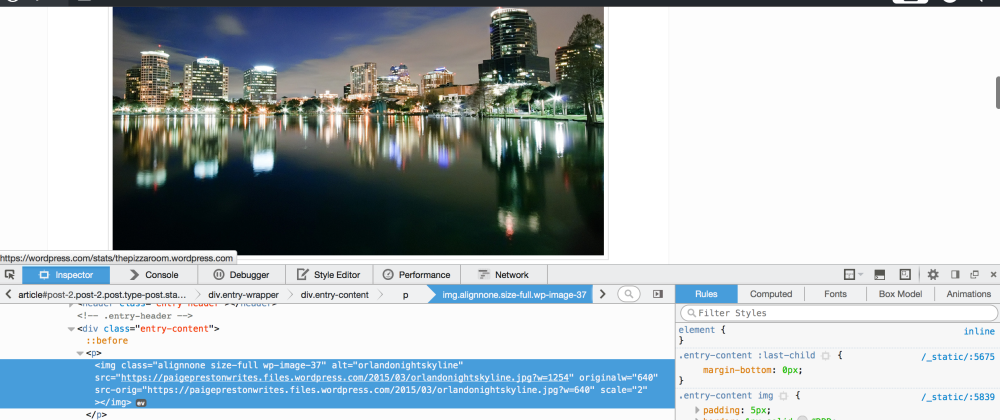
Going down the page, Paige has a prominent picture of the Orlando skyline:

Essential to any image you feature on your webpage (or any digital media) is the inclusion of alt text. You can see here in the blue highlighted section of the html after “<img> is the phrase “alt=’orlandonightskyine”. Because she included the alt text, a screen reader would say exactly that: “Here is a picture of Orlando night skyline.”

Image of a blog that features the Orlando skyline, with the appropriate alt text included in the html

The html of Paige’s front page

Lastly, I really love the text design. To make her post more readable and scannable, Paige included an unordered (bulleted) list:

A large block of text is broken up with a bulleted list

The scannability of Paige’s bulleted list

Yay for accessibility! Have a look at Paige’s blog post and leave some comments below and tell me what you think!